Dashboard
The dashboard is the headline view — the page you'll keep open in a browser tab and show people when they ask "wait, how many flights have you been on?"
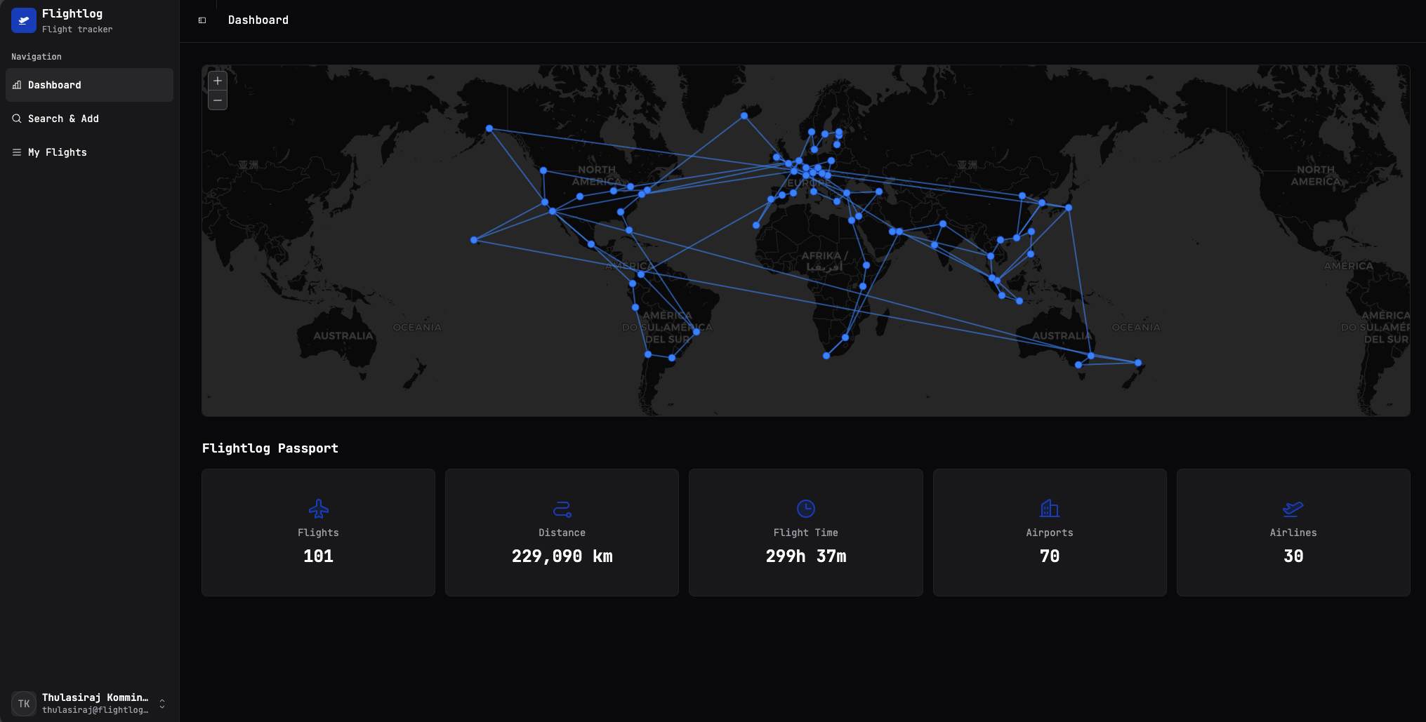
It has two halves.
The map
Every flight you've saved is drawn as a line between two airport dots. Hover or click on a dot to see which airport it is. The map projection is the standard Mercator-style world view; long-haul routes curve the way you'd expect on a globe.
A few things worth knowing:
- Same route, multiple times = one line. The visual won't get noisier the more you fly the same hop — but the underlying flight count will increase, so the Flights total below stays honest.
- Airports without coordinates won't draw a line. This basically never happens in practice (the bundled airport database covers all the commercial ones) but if a flight ever fails to render on the map, it's almost certainly that the AeroDataBox response didn't include a recognised IATA/ICAO code.
Flightlog Passport
The five tiles under the map summarise your entire history:
| Tile | What it counts |
|---|---|
| Flights | Every saved flight, including duplicates (a round-trip is two flights). |
| Distance | Sum of all the great-circle distances, in kilometres. |
| Flight Time | Sum of scheduled flight durations across everything you've logged. |
| Airports | Unique airports you've passed through (departure or arrival). |
| Airlines | Unique airlines you've flown. |
These update in real time as you add or delete flights — there's no "refresh stats" button, and there doesn't need to be one.
Cancelled flights still count… mostly
A flight marked Cancelled still shows up in your log (so your history is complete), but it won't add to Flight Time. It does count toward Flights, Distance, Airports and Airlines — you booked it, you remember it, it's yours.
What's not on this page
The dashboard is deliberately read-only — there's nothing to click that takes you off it except the sidebar. If you want to add flights, head to Search & Add. To dig into your log, see My Flights.